The Cycle, Issue 118: Uni-Cycle
Ranking the first phase of City Connect uniforms, the Nationals' sneaky uni changes, and this week's labor negotiations update
In this issue of The Cycle . . .
Re-Cycling: More Different Than the Same
Rooting for Laundry: Ranking and cataloging 2021’s City Connect Uniforms, plus the Nationals’ Sneaky Uniform Changes
Labor Pains: Impasse Redux
Feedback
Closing Credits
More Different Than the Same
I named this newsletter The Cycle because of the cyclical nature of the baseball seasons. Every year is both the same and different. The similarities stem from that cyclical nature. You get Pitchers and Catchers around Valentine’s Day, the start of the exhibition schedule at the end of the February, Opening Day near April 1, All-Star voting and the All-Star break, the Hall of Fame inductions, the trading deadline, so on and so forth. The same events every year, but with different storylines and stars.
Last week, I launched the second year of The Cycle with an issue that was the same, but different, from the second-ever issue of The Cycle published exactly one year earlier, both breaking down the writers’ Hall of Fame voting to identify likely future inductees. However, because of the lockout, my ability to trace over last year’s topics with this year’s details, at least at this stage of the offseason, largely ends there.
The third issue of The Cycle compiled an aggregate list of the game’s top prospects from the lists released by Baseball America, Baseball Prospectus, MLB Pipeline, and The Athletic’s Keith Law. However, in compiling last year’s list, I felt that Law’s list, the only one compiled by a single observer, was too idiosyncratic, and I planned to omit it from this year’s aggregation. Because MLB.com is avoiding any discussion of players in the MLB Players Association, and because some portion of the top-100 prospects are already on 40-man rosters, MLB Pipeline won’t have it’s top 100 list out until the lockout ends. That leaves me with just two lists, and I’d rather have a larger sample, so I’m putting off that prospect aggregation, for now.
Next up in last year’s Cycle was my uniform rankings, which ranked the uniform sets worn by each of the 30 teams in 2020. However, there were no new, full-set uniform redesigns last year, and the Cleveland Guardians have yet to do a proper uniform reveal for 2022 (likely in part due to the inability to dress their players up in the new duds due to . . . the lockout!). Thus, redoing those rankings for 2021 would not be “the same but different” but rather just straight up redundant, and looking forward to 2022 wouldn’t work, either, as there may be additional changes yet to be announced.
After that, I got into Offseason Report Cards (not yet) and Spring Training Previews (ha!), and into regular Spring Training coverage. So, the best I can do for now, in terms of following last year’s game plan, is to zoom in on some of the uniform changes that did happen last year. Thus, today’s issue will focus on the seven City Connect uniforms that debuted last year, the Nationals’ surreptitious, on-the-fly changes, then wrap up with an update on the increasingly contentious labor talks.
Rooting for Laundry
2021 City Connect Uniforms
Not counting Cleveland’s rebrand (breakdown here) and the Royals’ November unveiling of their new look (breakdown here), both of which are redesigns for the 2022 season, the biggest baseball uniform news in 2021 was official MLB uniform provider Nike’s new City Connect program for Major League Baseball. Effectively an MLB version of Nike’s City Edition uniforms in the NBA, the City Connect uniforms are manufacturer-mandated home alternates for all 30 teams, ostensibly with thematic connections to those teams’ geographical homes, that are being rolled out across three seasons. The first seven of those uniforms debuted on the field in 2021.
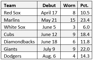
Here's a quick breakdown of which seven teams debuted their City Connect uniforms last year, when they debuted on the field, how many times they were worn, and in what percentage of their remaining home games each team wore their City Connect unis (thanks to the invaluable UniformLineup.com for keeping track of what every team wears in every game):
I broke down the first five of the uniforms above when they were unveiled during the season, but the Giants’ and Dodgers’ City Connects slipped by without my commentary. Thus, in lieu of my full, thirty-team uniform rankings, I thought I’d rank 2021’s seven City Connect uniforms with some additional commentary about each.
Normally, I present my uniform rankings from worst to best, in part to get the uglier stuff out of the way quickly and put the focus on the league’s best looks. I don’t particularly like any of the City Connect uniforms, however. So, starting with the premise that they are all varying degrees of ugly and poorly conceived, these rankings will go from best to worst. (Note: many of the close-up images of the jersey elements below are from Chris Creamer’s invaluable SportsLogos.net)
1. “Wrigleyville” Cubs
Debuted: June 12
Worn: 9 times (18.4 percent of remaining home games)
Best Part: The caps
Worst Part: The pants
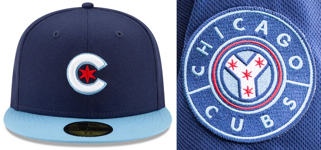
My initial reaction to these uniforms last June was literally “ho-hum.” Little did I know then what a rave that would prove to be. The Cubs’ City Connect uniforms are, to my eye, the most successful at incorporating city-specific signifiers while also still looking like one of that team’s uniforms. The uniforms use a navy blue rather than the Cubs’ usual royal, but they balance it with the powder blue and red stars from Chicago’s excellent city flag. They keep the Cubs’ C (or “c”—I always see it as lowercase, be it because cubs are baby bears or because of the lack of a serif) in place on the caps. As for the head-to-heels navy, which I find objectionable in the abstract, it does recall the team’s 1911–1913 road uniforms. That last might be a stretch, particularly as the Cubs never wore those uniforms in Wrigley Field (it hadn’t been built yet, and they were road uniforms), but it looked like a proper deadball-era throwback on the field.
The uniforms also have “Wrigleyville” arched in the shape of the top of the ballpark’s famous marquee, and a sleeve patch patterned after Chicago’s “municipal device,” which can be seen on the marquee of the Chicago Theater, among other places around the city, and was inspired by the fork in the Chicago River. The Cubs even used it in a design celebrating their National League championship in 1906.
The Cubs debuted the uniforms on a Saturday, then wore them in every Friday home game over the remainder of the season. I’d still prefer they wear their classic pinstripes for every home game, but I didn’t hate these. Again, that’s a rave in this context.
2. “Foggy” Giants
Debuted: July 9
Worn: 9 times (22 percent of remaining home games)
Best Part: The clean, orange-and-white color scheme
Worst Part: The bridge on the cap
Again, simplicity carries the day here for San Francisco. Charged with coming up with a uniform celebrating their city, the Giants went with the two largest and most obvious things (the Golden Gate Bridge and fog), picked just one of their existing team colors (orange), and produced what, outside of the context of the team’s existing uniform set, might be the best look from this initial batch of City Connect unis.
This is just a nice, clean look. In the abstract, it’s much nicer than the Cubs’ Wrigleyville uniforms. The only reason I rank it below the Cubs’ uni is that the lack of black makes this feel less like a Giants uniform, and the design is almost too subtle, such that it doesn’t feel that much like a San Francisco uniform, either.
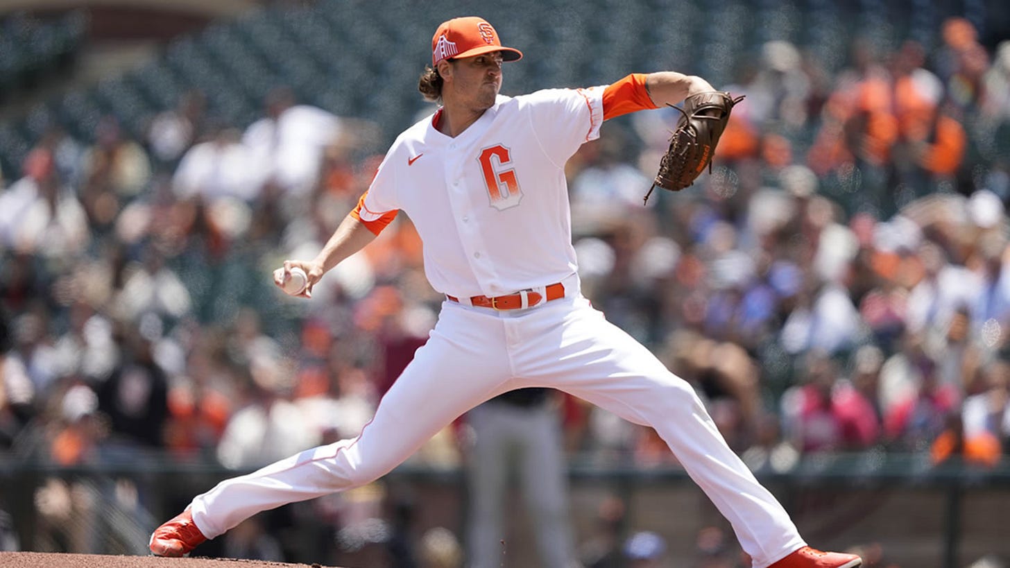
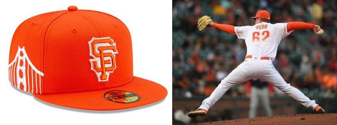
The fog concept is represented by the way the insignia on the chest, the numbers on the back, the bridge design on the sleeves, and the stripe on the pants are all designed to look like they are shrouded in fog at the bottom (click the images above to get a closer look at those elements). However, the result of all of that white intermingling with the orange—which is indeed the Giants’ standard shade—is that it makes the orange look more like a creamsicle color, and the combination of the creamsicle feel of the orange and all of that bright white (noticeably not the cream of the Giants’ standard home uniforms) is more reminiscent of the classic Tampa Bay Buccaneers uniforms than anything associated with the baseball Giants. That disassociation is not helped by the decision to use a skinny* version of the Giants’ G as a chest logo, something the team has never done before, rather than a city-connected interlocking SF, which the team has.
*skinny so as to better resemble the bridge towers, we’re told
As for the bridge, it’s fine on the sleeves, but the bridge on the cap is overkill. It’s only on one panel (the right side), and, perhaps due to the limitations of the embroidery, does not have the identifiable Golden Gate shape of the sleeve version, so it just looks like a generic suspension bridge.
The Giants do upgrade this look slightly when at bat. While the Red Sox, Marlins, and Cubs all included matching batting helmets in their City Connect looks, the Giants stick with their usual black helmets, which helps bring back that missing team color.
After introducing this uniform during a weekend series, the Giants, who like to keep their alternates orderly (something I appreciated), wore it for every Tuesday home game over the remainder of the season.
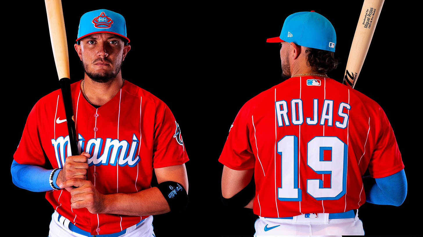
3. Miami “Sugar Kings”
Debuted: May 21
Worn: 15 times (23.4 percent of remaining home games)
Best Part: The history lesson
Worst Part: The batting helmet
There’s a lot to like about the Marlins’ City Connect uniform, and one very specific thing to hate. Let’s start with the good stuff.
First and foremost, this uniform is a burst of color from a team that made a big deal about switching to “our colores” after the 2018 season, then came out with uniforms dominated by black, white, and grey, with those “colores” appearing only as outlines and thin lines of piping. You wouldn’t know it from their standard set, but the red and blue of these City Connect uniforms are the Marlins’ actual colors. In that way, alone, these are a welcome addition to Miami’s overall uniform scheme.
Second, these uniforms are a tribute to the Havana Sugar Kings, adapting the Sugar Kings’ sugar-bag and crown logos and jersey script. The history is a little awkward, in that the Sugar Kings were actually a Reds affiliate and an opponent of the former minor-league Miami Marlins (all of which I explained in my initial breakdown of these uniforms). Still, this is a celebration of baseball’s deep Latin-American roots, and Cuban roots, specifically, which does indeed have a strong connection to the city of Miami.
That’s two big wins right off the top. What chips away at that are the little things. This is more of a Sugar Kings uniform than a Marlins uniform, despite the “MM” in the crown and the Marlin patch on the sleeve (which gets a similar secondary-mascot placement as the Rays’ vestigial devil ray). I don’t like the pinstripes, which only exist on chest and back of the jersey, but not the sleeves, don’t connect at the shoulders, and remind me more of a soccer jersey. Most significantly, the “matching” batting helmet is one of the ugliest uniform elements in the majors, full stop. It’s the wrong shade of blue, such that it doesn’t even match the insignia sticker on the front, and the red accents in the contours remind me of the disastrous two-tone batting helmet “innovations” of the first decade of this century, all of which were quickly discarded for good reason.
There’s more good than bad here, and if they fixed the helmet (an easy thing to do), they’d have a shot at the top spot Then again, making their standard uniforms more colorful or legible is easy, too, but three years in, the Marlins have yet to do even that.
After introducing these uniforms, the Marlins wore them in roughly half of their remaining weekend home games, but never wore then during the week (Monday to Thursday).
4. “Southside” White Sox
Debuted: June 5
Worn: 3 times (6.0 percent of remaining home games)
Best Part: Looks like a White Sox uniform
Worst Part: Looks like pajamas
In the middle position on this list we have the least interesting of all of these uniforms. The White Sox’s “Southside” informs don’t stray that far from their standard black alternates, and most of the differences are detriments, but then the White Sox wore these just three times last year, the last on July 16, so these were mostly for the fans, anyway.
Start with the White Sox’s black alternates, replace the “Sox” on the left breast with “Southside” in a matching font across the chest (that “Southside” word mark, incidentally, is the best individual element of these uniforms). Move the number to the lower left in a similarly ornate, Tuscan font (repeated for the number on the back). Keep the sock patch on the sleeve, but reverse the order of the sleeve striping for no good reason. Add a pinstripe and a sublimated “greystone” texture (that does not match the city’s light-gray greystone buildings), matching pants, and a cap that says “Chi” instead of “Sox,” with a pointless gray outline, and you have the “Southside” uniforms.
They’ve very obviously White Sox uniforms. They’re very obviously Chicago uniforms. However, that sublimated pattern makes them look like a soft, heathered cotton, and, with the matching pants, they look more like pajamas than any other baseball uniform I can recall. Here’s my original breakdown. Next . . .
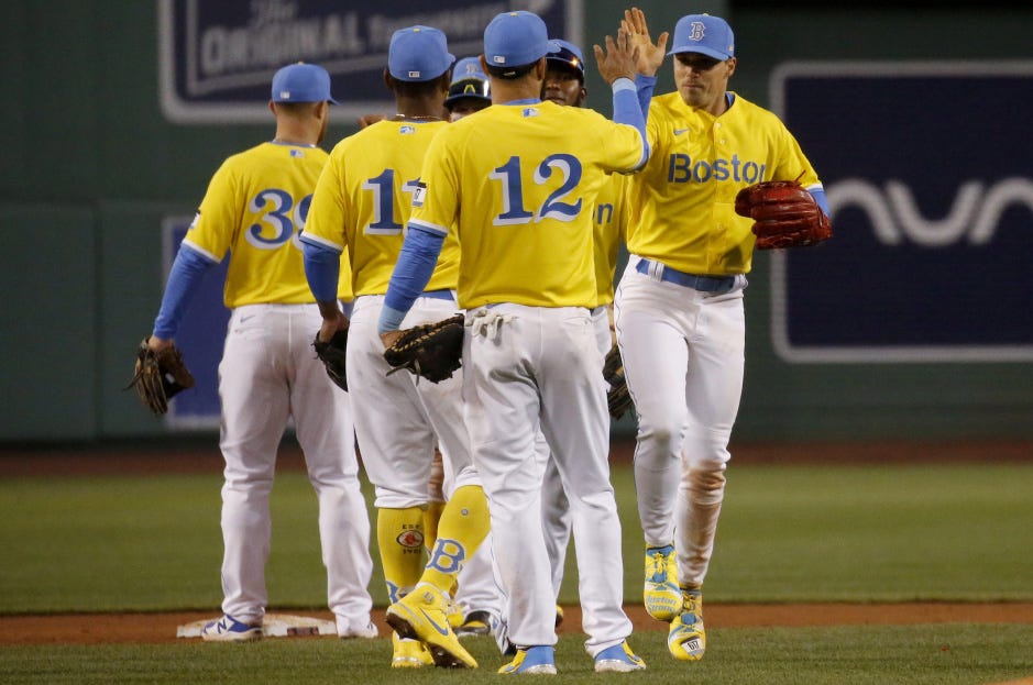
5. Boston “Marathon”
Debuted: April 17
Worn: 8 times (10.5 percent of remaining home games)
Best Part: The cap
Worst Part: Is not a Red Sox uniform
Did you know these were the official colors of the Boston Marathon? I did not, at least not before these uniforms were unveiled last April (original breakdown here). Do you see these uniforms and think “those are the Red Sox”? I do not. Maybe they mean more to actual Bostonians. I have my doubts.
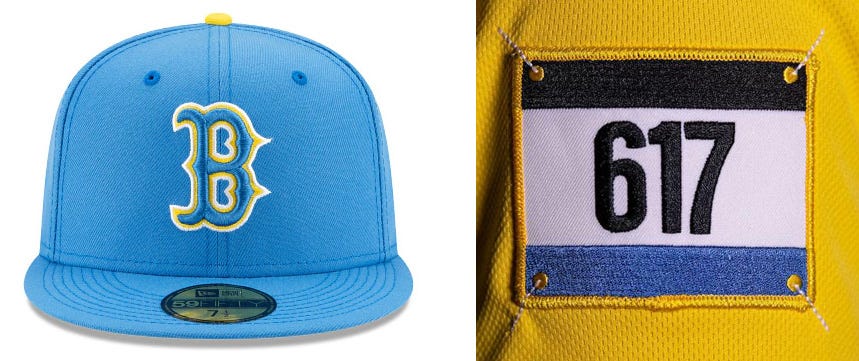
Out of context, I love the color scheme (again, the Rays should adopt this full time as part of a redesign; it’s right there). In context, it’s completely out of place on the home team at Fenway Park. The cap is great on its own, but it’s more UCLA and Boston Bees (that is, the 1930s Braves) than Red Sox, even with that familiar B.
Screwing down on the specifics, the cap is great (but would be better without the white outline). The number-bib sleeve patch with the eastern Massachusetts area code is clever, but there’s no Red Sox patch anywhere. The bright yellow jersey is a welcome splash of color in a league with too many teams in navy and red, but it’s a bit too much yellow. The lack of names on the back contributes to the classic look of Boston’s home whites, but here it just makes these jerseys look like cheap knockoffs.
Perhaps most problematically, literally nothing about the jersey suggests this is a Red Sox uniform. When I see these, I still think Tour de France first, then Boston Marathon, then Red Sox, and that’s only after considerable exposure and practice. If you look closely above, you can see they snuck a Red Sox log onto the left calf of the Stance socks that go with this, but that’s such a lazy, ugly afterthought (I have such a strong dislike of Stance’s designs, all of them) that it only makes things worse.
Perhaps sensing this uniform was a misstep, the Red Sox wore this for just two of their four games on Patriots Day weekend, and not on Marathon day itself (when they wore their usual Boston-strong jerseys, which also look like cheap knockoffs due to the lack of a navy outline on the wordmark), then didn’t bring it back until September 17. They built out a winning streak in the uniform’s return, and thus stuck with it for six straight games, until the streak was snapped, then they never wore it again.
They’ll surely bring it back for Patriots Day weekend again this year, if there’s baseball that weekend that is. All of these uniforms will remain in rotation, however limited, but I’d be happy to never see them again, no matter how much I like this color scheme in the abstract.
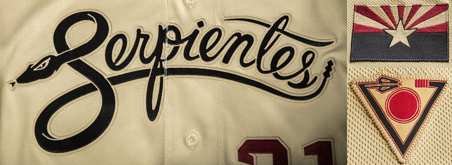
6. Arizona “Serpientes”
Debuted: June 18
Worn: 6 times (11.8 percent of remaining home games)
Best Part: The concept
Worst Part: The execution
I had high hopes for this one. The Diamondbacks have a short history but have spent most of it in ugly uniforms. I think their current set might be their best, but I still thought that the City Connect program might benefit them more than other teams, as it gave them an excuse to try a whole new direction.
They seized that opportunity by experimenting with a whole new name, los Serpientes, properly translating their name (or, at least, their nickname, the Snakes) into Spanish, rather than lazily sticking a “Los” on their jersey next to the English word (see this, or below). They used a clever, rattlesnake script to put the more serpentine word across the chests of their City Connect jerseys. They also came up with a new “Valley of the Sun” patch (lower right above) incorporating their old “db” snake head logo. Mix in a Sonoran sand–colored uniform and cap with some Sedona red, both existing team colors but swapped in terms of importance, and I though they might have really had something (or at least the start of something).
Then I saw it on the field.
The dang thing is a sickly yellow color. The wordmark is illegible from any reasonable distance. The only place they put the desert sun logo is on the jersey tag, which is tucked in, and on the Stance socks their players (correctly) chose not to wear, and on the socks that red-hot desert sun is . . . sand colored? The Diamondbacks have the entire southwest desert region to themselves, a rich visual palate from which to draw uniform ideas. It’s stunning that they continue to fail, time and again, to make good use of it.
The D’backs wore this on four Friday nights, including the night they debuted it, and in their penultimate weekend series, which was Hispanic Heritage Weekend. Just six times total. That was too many.
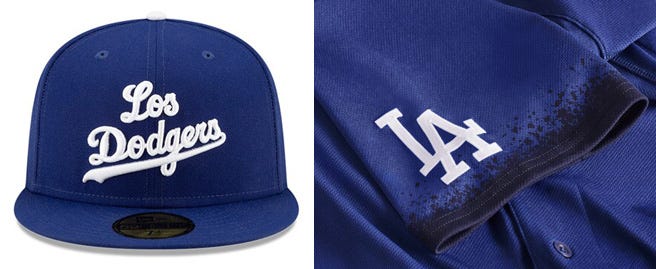
7. “Los Dodgers”
Debuted: August 6
Worn: 4 times (14.3 percent of remaining home games, 10.0 percent of all remaining games)
Best Part: The backs, I guess
Worst Part: The cap
I imagine you reading through these rankings and thinking, “Man, Cliff really hated those Serpientes uniforms. Wait, there was a City Connect uniform he like less? How could that . . . ohhhhhh.”
Yeah. “Los Dodgers.” Lazy and ugly. At least the Diamondbacks tried.
Of the seven City Connect uniforms released last year, four made an attempt to appeal to a local minority community. The Marlins appealed to Miami’s Cuba population, which makes up roughly one quarter of Miami-Dade County’s population, by paying tribute to a team from Havana that predated the American embargo. The Diamondbacks put a Spanish nickname on their jerseys to appeal to the local Hispanic community. The White Sox repped the Southside, which is more than 90 percent Black. The Dodgers . . . put “Los” in front of the English version of their name and darkened the tips of their sleeves with a spray-paint effect to pay tribute to the city’s murals.
The murals thing was a good idea. Los Angeles does have a rich culture of public art comprised of spray-painted murals, primarily by Black and Latinx artists. But if you’re going to go with a mural theme, go with a mural theme. Write Dodgers in graffiti-style lettering across the jersey, get some more colors and details in there. Make it look like one of those artists made your uniform, not like something Orel Hershiser made with the spray-can tool in MS Paint.
And please stop with the “Los [English word]” construction. At the very least, give the local Chicano community an official “Los Doyers” jersey.
That’s just the conceptual problems. The execution. Please. Hot garbage from head to toe. You can’t even see the spray-painted sleeve details from a distance (I thought it was a skyline when I saw it in game action). There were white stance socks with a spray-paint splatter on them (again, barely visible) that were supposed to go with the uniform, but, as you can see above, the players didn’t wear them after the uni’s debut. As a result, the look is solid blue, even for the high-cuffed players.
Then there’s the cap: bad up close, worse from a distance. Lazy regardless of proximity.
Just awful.
It’s no wonder the Dodgers wore these just twice after their debut weekend, and one of those games was on the road (the only time last year that a City Connect uniform was worn on the road by any of these seven teams).
Could the City Connect possibly produce a worse uniform from the remaining 23 teams? I shudder to think.
Hidden in Plain Sight: The Nationals’ Uniform Changes
When the Expos moved to Washington and became the Nationals in 2005, they adopted the curly W first worn by the expansion Washington Senators in 1963 as their primary mark. Initially, the Nats wore it only on their caps, but, in 2011, they made it the centerpiece of their home and alternate uniforms, appearing on the left breast of a home-white jersey, a red alternate, and a navy alternate with a stars-and-stripes-filled W. In 2017, the Nationals added a white stars-and-stripes version, giving them four curly-W jerseys, any of which could be worn at home.
I never much liked the curly-W jerseys, in part because the W and the number on the right side of the jersey were unbalanced. So, despite the fact that they already had way to many jerseys, I was excited to see them add a navy alternate with a script “Nationals” across the chest in 2018, and even more excited when they settled on that as their exclusive postseason look during their 2019 championship run.
Building off the success of that “Nationals” jersey, the Nats added yet another jersey for the 2020 season, a white version of the “Nationals” jersey, which came paired with a new, white-front cap with a block W in front of a silhouette of the Capitol dome, a logo that dated back to the original Senators franchise. At the time that they announced those additions (along with another alternate cap with a power-pitcher logo that dated to the expansion Senators), they didn’t announce the discontinuation of any of the other jerseys, which meant they appeared to be entering the 2020 season with seven jerseys, the four curly W’s, the two “Nationals,” and their “Washington” road grays.
Then the pandemic hit.
When the 60-game season finally began in July, the Nationals did something unexpected, and largely unnoticed. They mothballed all four curly-W jerseys and made a new, gold-trimmed version of the white “Nationals” jersey (with corresponding gold-trimmed cap) their primary home jersey for that abbreviated victory lap of a season. They wore the new white “Nationals” jersey, the one without the gold trim, and the corresponding Capitol-dome cap just once all season and didn’t don the curly-W jerseys at all.
That gold-trimmed jersey was obviously a one-year phenomenon, designed to celebrate their championship from the year before, which left open the question of just which of their many uniforms the Nationals would bring back in 2021. I held out hope that they would simply drop the gold trim and go with a three-jersey set of the white and navy “Nationals” and the road grays. They didn’t keep it that simple, but they came close.
Last year, the Nationals brought back just two of their curly-W jerseys, and on a very limited basis. The stars-and-stripes versions remain trapped in 2019. The standard white and red alternate came back last year, but for a total of just 29 home games. In the other 52 home games, the Nationals wore their white (37 times) or navy (15 times) “Nationals” jerseys. Thus did the Nationals backdoor the adoption of their white “Nationals” jersey as their primary home jersey without actually announcing that they were doing so.
But wait, there’s more. The white-front Capitol-dome cap that was designed to go with that jersey was paired with it in that one game in 2020 and in April and May of 2021, but in Game 1 of a double-header on June 12, the Nationals wore their traditional red home caps with the white “Nationals” jerseys, and the white-front caps never made another appearance that season.
So are the stars-and-stripes curly-W’s gone? I’m cautiously optimistic that they are. Are the white-front Capitol-dome caps gone? That’s less clear. Meanwhile, that power-pitcher alternate cap has yet to make it into a regular-season game and may never do so. What will the Nationals wear in 2022? It seems we won’t know until they wear it, but the fact that the team seems to have settled on the “Nationals” jerseys and red caps as their primary home look is an increasingly rare example of common sense and general decency winning out in Washington.
Labor Pains
Impasse Redux
So, remember last week when I wrote the following about baseball’s collective-bargaining negotiations?
. . . at long last, they are finally talking, and while the two sides remain very far apart on the core economic issues that threaten to push back Spring Training and delay the start of the regular season, they do appear to be making some degree of progress.”
Yeah, not so much this week.
Last week, in the wake of the owner’s latest proposal on Tuesday, January 25, Giants player representative Austin Slater, expressing an opinion that appears to be shared by most of his union brethren, called the proposal “disingenuous” and “a smokescreen.”
On Monday, The Athletic’s primary labor correspondent Evan Drellich penned a piece with his colleague Ken Rosenthal about the growing pessimism surrounding the negotiations. In sort, “Major League Baseball contends it is proposing a better deal for players than the one they had under the most recent collective bargaining agreement. And the Players Association contends that the deal is worse.”
On Tuesday, the players made their latest proposal, but, reflecting their growing belief that the owners are not negotiating in good faith, made only minimal concessions. Of just two notable changes in the players’ proposal was the reduction of the size of the pre-arbitration bonus pool from $105 million to $100 million (the owner’s proposal was $10 million, the disingenuousness of which is proven by the fact that the miniscule change in the players’ offer is fully half of the total of the owners’ offer).
The owners initially said that they would present their counterproposal before the end of this week, but, on Thursday, they changed tacks. Rather than continue to negotiate with the players, Major League Baseball requested the assistance of the Federal Mediation and Conciliation Service in resolving the negotiations.
It’s not unusual for labor disputes of this magnitude to involve federal mediation, but that mediation is no guarantee of progress. What’s more, the mediation has to be requested by both sides. The latest report from Drellich on Thursday night was that the union is expected to reject the request for mediation. Per USA Today’s Bob Nightengale, one anonymous union member with direct knowledge of the negotiations called the owners’ request a “publicity stunt.” In other words, the players think that the owners are grandstanding, trying to make it look like they only want resolution despite failing to bargain in good faith.
Tuesday’s 90-minute meeting was described as “heated,” and this tactic by the owners seems to have only turned up the temperature. It could thus be considered a significant set back. Both sides have effectively reached a point at which they are once again refusing to negotiate in any meaningful way.
If you had any doubts, it now seems guaranteed that Spring Training will be disrupted by the lockout. This latest impasse has me convinced that the regular season will be altered, as well, as neither side is likely to budge until the stakes are raised by the loss of regular season salaries and revenues.
So, who’s up for more issues about uniforms and baseball cards?
Feedback
I want to hear from you. Got a question, a comment, a request? What would you like to read about in lieu of actual baseball news? Reply to this issue. Want to interview me on your podcast, send me your book, bake me some cookies? Reply to this issue. I will respond, and if I find your question particularly interesting, I’ll feature it in a future issue.
You can also write me at cyclenewsletter[at]substack[dot]com, or @ me on twitter @CliffCorcoran.
Closing Credits
Here’s a thing I just learned: Original Pretenders guitarist James Honeyman-Scott discovered Violent Femmes busking on a street corner outside of Milwaukee’s Oriental Theatre when the Pretenders were playing a gig there in late August of 1981. Lead Pretender Chrissie Hynde invited the trio to play a brief acoustic set as part of that night’s lineup, which they did, but it didn’t result in their big break. The Femmes were booed by the Pretenders; crowd and were still trying to catch a break a year later, when they opened up for Richard Hell at GBGB’s in New York. A rave review of their part of the show from New York Times critic Robert Palmer (not the singer) played a more direct role in getting them signed. Honeyman-Scott didn’t live to see the Femmes get their break or to hear their now-essential debut album. He died of a cocaine overdose in June 1982.
That first, self-titled Violent Femmes album came out in April 1983, but while it stands as a classic today, it took eight years to go platinum. That fits with my memory of it being a big record among the outcasts and theater kids in my high school in the early 1990s, like it was a long-held secret that was finally being shared, swept out of the college radio stations and into the mainstream along with the rest of 1980s alternative music in the wake of the alt-rock revolution ushered in by Nirvana. Now they play the “Blister in the Sun” riff on the organ at ballgames to get the crowd to clap. Life is strange.
I bring this all up as a way to introduce not a song from that album, but a contemporaneous non-album single by the band released on Rough Trade in the UK in December 1983. The song is “Ugly,” a perfectly representative example of the sound of that first album which sounds like its from the point of view of a broken-hearted ex-boyfriend hiding his pain behind crude, sing-songy insults, but that doesn’t really concern me here. Rather, this goes out to Nike and its City Connect uniforms. They know why, they ain’t got no alibi.
The Cycle will return next week with . . . something.







If the options are more coverage of the owners (barely) bargaining in bad faith … or …
Go with the “or” …
- The best uniforms in each team’s past?
- The best baseball card designs of 1970 thru 1989?
- The best (yes, there’s sooooooo much negativity out there, I’m feeling all best-y) looking baseball cards of non-Hall of Famers?
- The top 10 scallywags in baseball history?
- Or … anything that reminds us baseball is fun?